06 / UX case study.
Melbourne City Website
A redesign of the Melbourne City FC website, taken from user research and a persona through to wireframes and a final design. The aim: get fans to fixtures, memberships and news in as few clicks as possible.
UX research · Wireframing · UI design
The result
Made for match week.
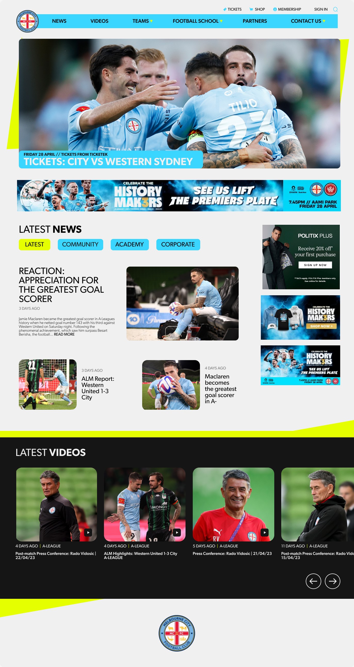
The finished homepage first. Scroll inside the monitor to browse it the way a fan would, then see how it got there.
The problem
The existing site's layout and content structure made essential information hard to find. Fans were complaining they couldn't locate fixtures, memberships or news.
The goal
Reorganise the layout and content so the essentials are always in easy reach, answering those complaints and making the site work harder for the club.
The research
Four pain points.
- 01
Lost fans
Fixtures, memberships and news were buried in a confusing layout.
- 02
Low engagement
Poor usability stopped fans exploring further into the club's content.
- 03
Ongoing complaints
Steady negative feedback was putting the club's reputation at risk.
- 04
Club goals held back
Memberships, news and fan engagement were all underperforming online.
The persona
Meet Daniel.
32, electrician, Melbourne. A lifelong member who isn't tech-savvy and is short on time. He just wants the latest news, his membership benefits and when City are playing.
Goals
- Stay across club news
- Find tickets and deals
- Keep up with member benefits
- Feel part of the community
Frustrations
- No time to dig for information
- Busy weekends, needs match times at a glance
- Forgets what his membership gets him
The fix
Built around Daniel.
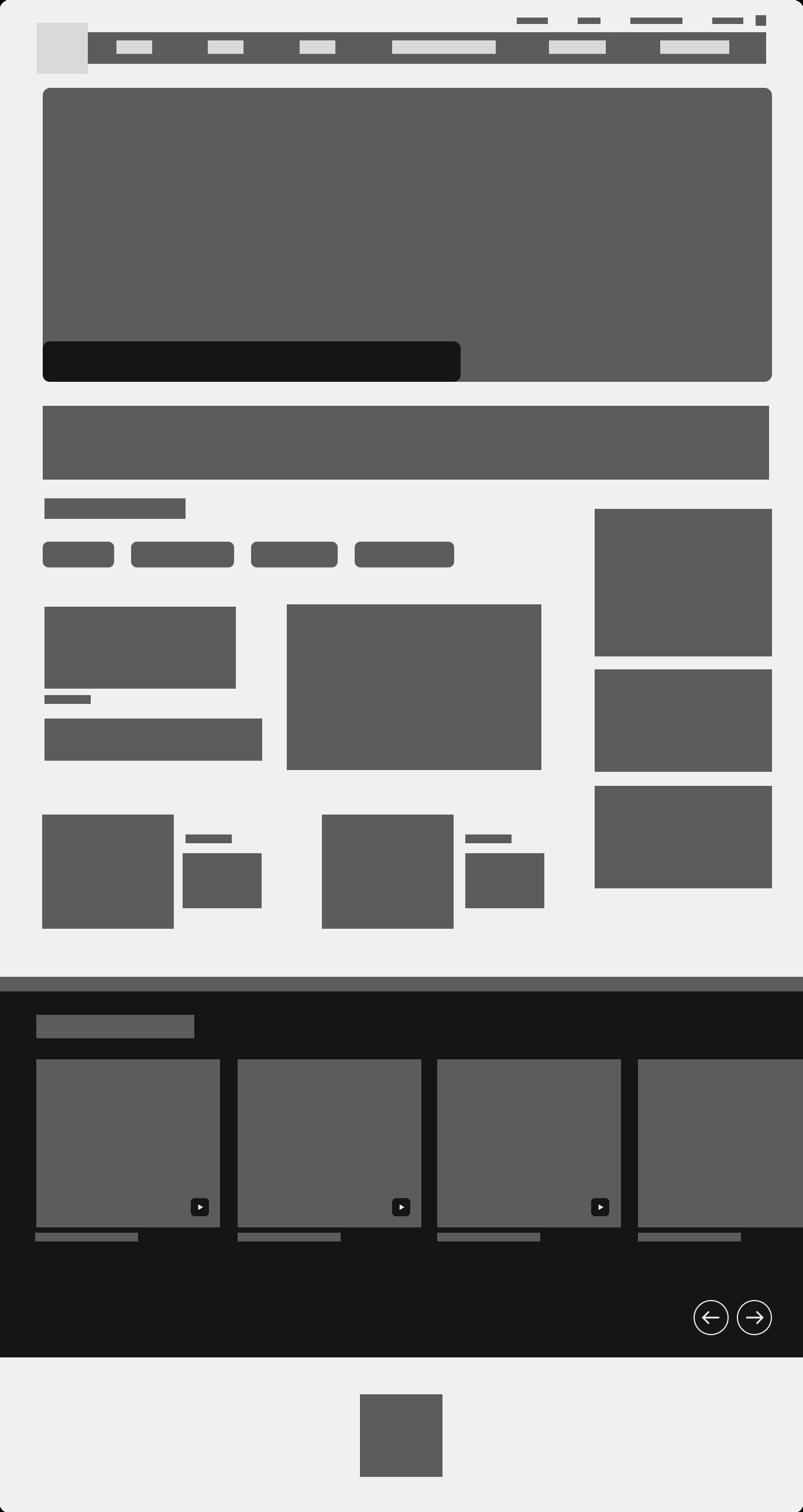
- Tickets, Shop and Membership pinned in a utility bar on every page.
- A simplified main menu: News, Videos, Teams, Football School, Partners, Contact.
- The hero leads with the next home match and where to buy tickets.
- News filtered by Latest, Community, Academy and Corporate.
- Latest videos in a swipeable carousel, with the campaign banner up top.
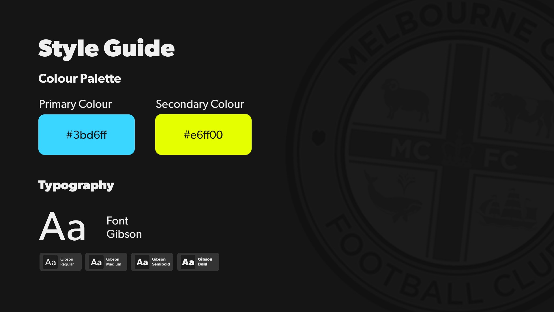
The style
Wireframe to final
Look closer.
Move your cursor over the wireframe to see the final design through the lens.Tap the wireframe to flip it to the final design.